Cost and Features to Build...
July 17, 2025
Have you at any point needed to make videos or images take up your whole screen on a website? It’s not generally simple to do, particularly assuming that you’re using custom elements. In any case, you can relax, because there’s a special tool called the Fullscreen API JavaScript that can help!
The Fullscreen API is like a magic wand for web developers. It allows you effectively to turn elements on your website between fullscreen mode and regular mode. Whether you’re dealing with a video website, a photograph gallery, or some other sort of website, involving the Fullscreen API in JavaScript can make your site exciting and immersive for users.
In this blog, we’ll guide you through all that you want to be familiar with the Fullscreen API. We’ll explain how it functions, show you its coolest features, and show you how to involve it in your own projects. By the end, you’ll be a Fullscreen API pro, prepared to make marvelous fullscreen for your website guests. So how about we hop in and find the power of fullscreen mode together?
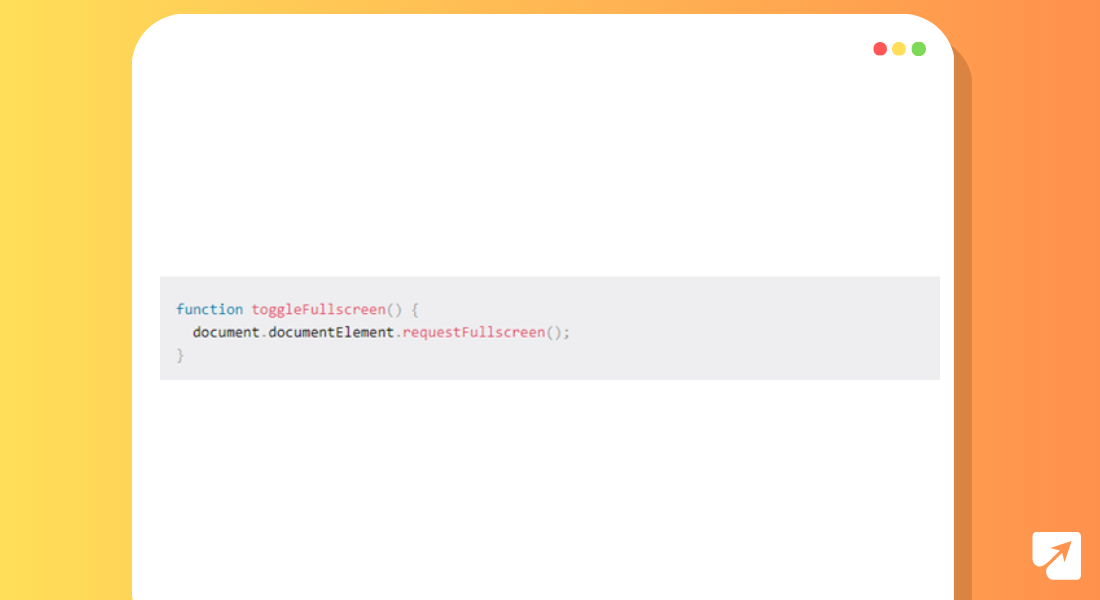
To enter fullscreen mode in JavaScript using the Fullscreen API, you can follow a simple methodology like the one demonstrated below. Assume you have a basic webpage with text and a button to toggle fullscreen mode:
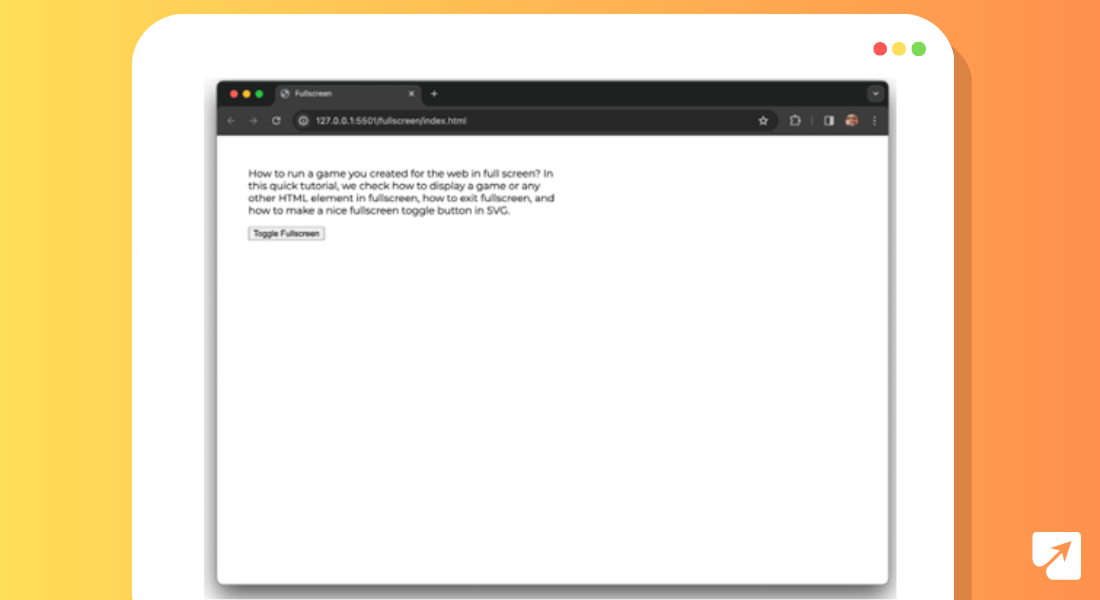
In this code snippet, we have a basic webpage with some text and a button marked “Toggle Fullscreen.” When the button is clicked, the toggleFullscreen JavaScript function is executed. This capability calls the requestFullscreen strategy on the document.documentElement, which is the root component of the document.
Also Read: How To Use ChatGPT API In Python For Your Real-Time Data
By calling requestFullscreen, we instruct the browser to enter fullscreen mode, accordingly showing the whole webpage in fullscreen. It’s a clear and powerful method for upgrading the client experience by giving a fullscreen perspective on the content.
Try clicking the button, and watch as your website flawlessly transitions into fullscreen mode.
Have a go at tapping the button, and watch as your website reliably changes into fullscreen mode.
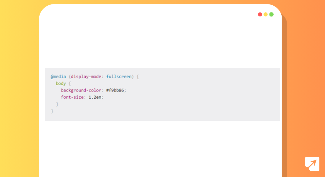
While implementing fullscreen mode on your website, it’s fundamental to consider how your content will show up in this expanded view. While fullscreen mode offers more space for your content to sparkle, it can likewise present design challenges if your layout isn’t responsive.
One way to deal with address this is by styling your content explicitly for fullscreen mode. By using CSS media inquiries, you can apply custom styles that are possibly activated when the display mode is fullscreen. This permits you to optimize the layout and appearance of your content for the larger viewport.
For example, you might need to adjust the font size, change background colors, or reposition elements to ensure optimal readability and visual appeal in fullscreen mode. By fitting your styles for fullscreen, you can make a more engaging client experience across all screen sizes.
Before we dig into how to exit fullscreen mode and create a visually appealing toggle button, we should investigate how you can improve your plan by styling explicitly for fullscreen. let’s explore how you can enhance your design by styling specifically for fullscreen. With responsive styling and thoughtful design choices, you can make the most of the fullscreen experience and captivate your audience with stunning visuals and content presentation.
When you’re making games with the canvas element and want them to fill up the whole screen, there are a few important things to think about.
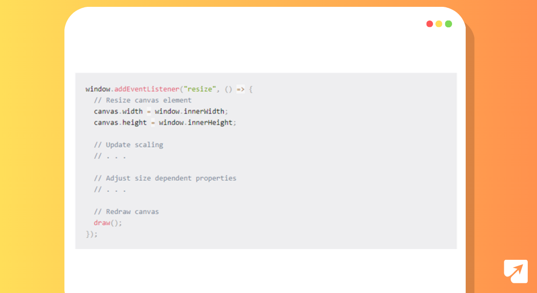
Imagine you’re creating a game like the classic Gorillas game, where the canvas is where all the action happens. To make sure your game looks good and works well in fullscreen mode, you can use something called the window’s resize event.
This event gets triggered whenever you resize your browser window or go into or out of fullscreen mode. By paying attention to this event, you can make your canvas change size to match the screen, so your game fills up the whole window.
You can also tweak other things like how big things look or their shape to make sure your game still looks good. After you’ve resized the canvas, you’ll need to redraw everything so your game stays nice and smooth.
Also Learn: Firebase Push Notification in JavaScript Apps
By using the resize event and making sure your game resizes properly, you can create awesome fullscreen games with the canvas element. This means players can have an immersive gaming experience, no matter what size screen they’re using. Just remember to plan carefully and make everything work well together, and you’ll have players hooked on your game in no time!
Exiting fullscreen mode in JavaScript is a clear process that can be achieved with only a couple of lines of code. By default, most browsers permit clients to exit fullscreen mode by pressing the Escape key. Be that as it may, if you need to give an alternative method, for example, clicking a button, you can undoubtedly carry out this functionality.
Here’s how you can create a toggle button to exit fullscreen mode:
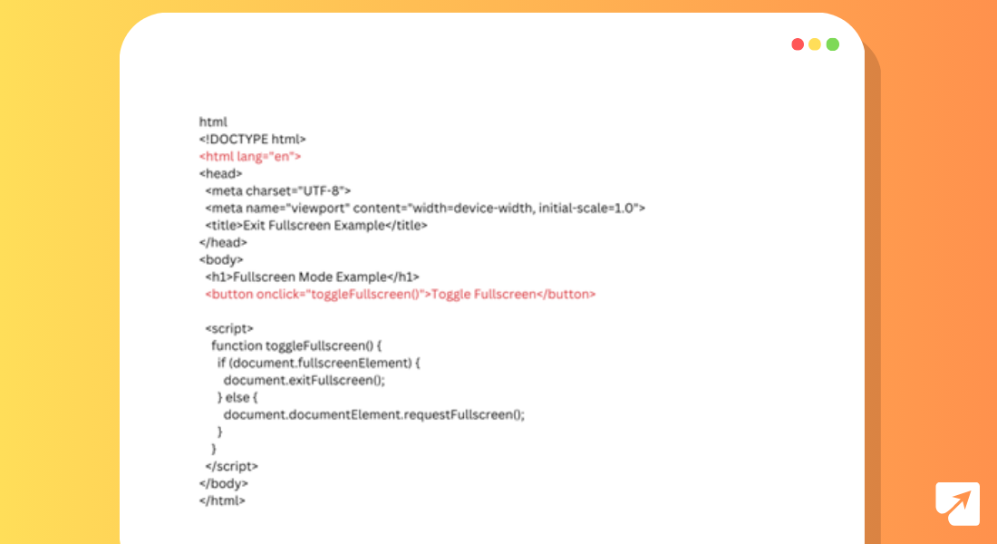
In this code snippet, we define a JavaScript function called toggleFullscreen that will be set off when the button is clicked. Inside this function, we check whether the document is presently in fullscreen mode by examining the fullscreenElement property. Assuming the property is characterized, showing that the document is in fullscreen mode, we call the exitFullscreen strategy to exit fullscreen mode. Otherwise, if the property is undefined, we use the requestFullscreen method to enter fullscreen mode.
By integrating this rationale into your website page, you can provide clients with a convenient way to toggle fullscreen mode on and off, upgrading their browsing experience and giving them more control over how they view your content.
To make a fullscreen icon with SVG, you can follow these steps toward planning a clear yet powerful icon like the one utilized on YouTube:
In this code, we characterize a button element with a class of “fullscreen-button” and an SVG element inside it with a class of “fullscreen-icon”. The SVG component has a viewBox property set to “0 0 24 24”, which characterizes the coordinate system and aspect ratio for the icon.
The path element inside the SVG characterizes the state of the fullscreen icon utilizing move-to (M) and line-to (L) commands. These orders indicate the directions of the points that make up the icon’s outline.
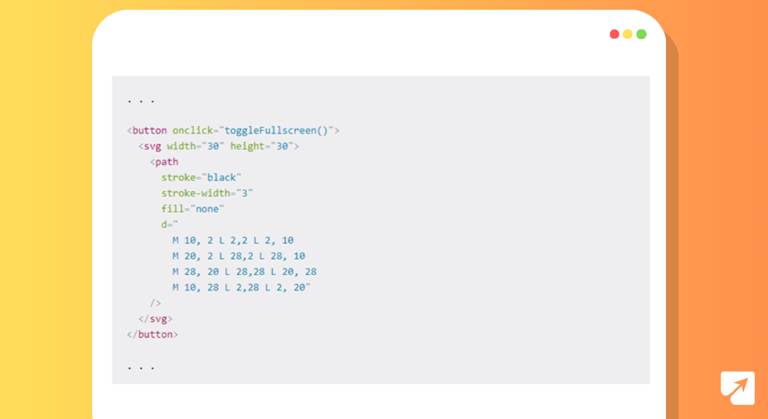
We then, at that point, use CSS to style the button and SVG icon. The “.fullscreen-button” class eliminates default button styling, while the “.fullscreen-icon” class sets the symbol’s size, stroke color, and stroke width.
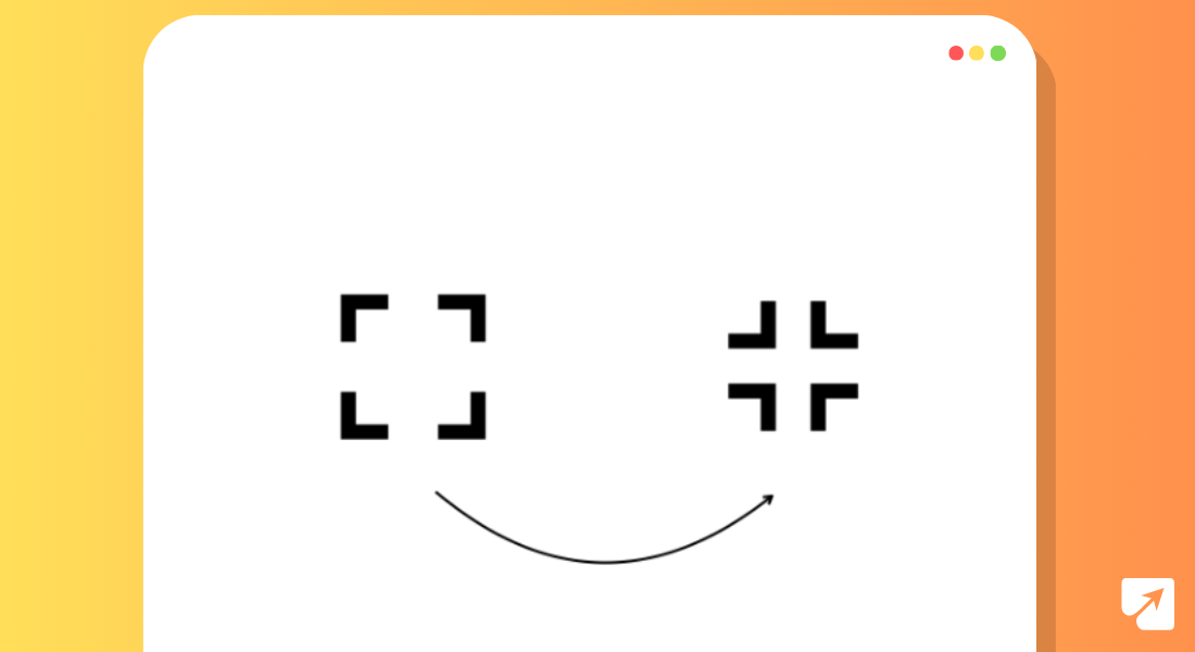
You can alter the SVG path to make different fullscreen icons or add extra styling to match your design preferences. With this process, you can undoubtedly integrate a fullscreen icon into your website page and upgrade the client experience for fullscreen mode activation.
To toggle the symbol’s appearance given fullscreen mode, you can utilize JavaScript to dynamically switch between various SVG paths inside a similar SVG element. This is the way you can accomplish this:
In this code, we characterize two ways inside a similar SVG element: one for the default icon representing entering fullscreen mode (‘fullscreen-icon) and one more for the icon representing leaving fullscreen mode (‘exit-fullscreen-symbol’). At first, the exit fullscreen icon is covered up utilizing the CSS ‘`visibility: hidden` property.
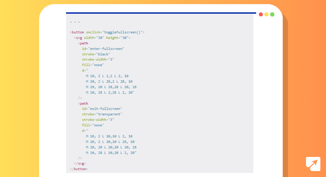
In the ‘toggleFullscreen’ function, we recover references to both SVG ways utilizing their special IDs. Contingent upon whether the archive is presently in fullscreen mode, we flip the visibility of the two paths as needed.
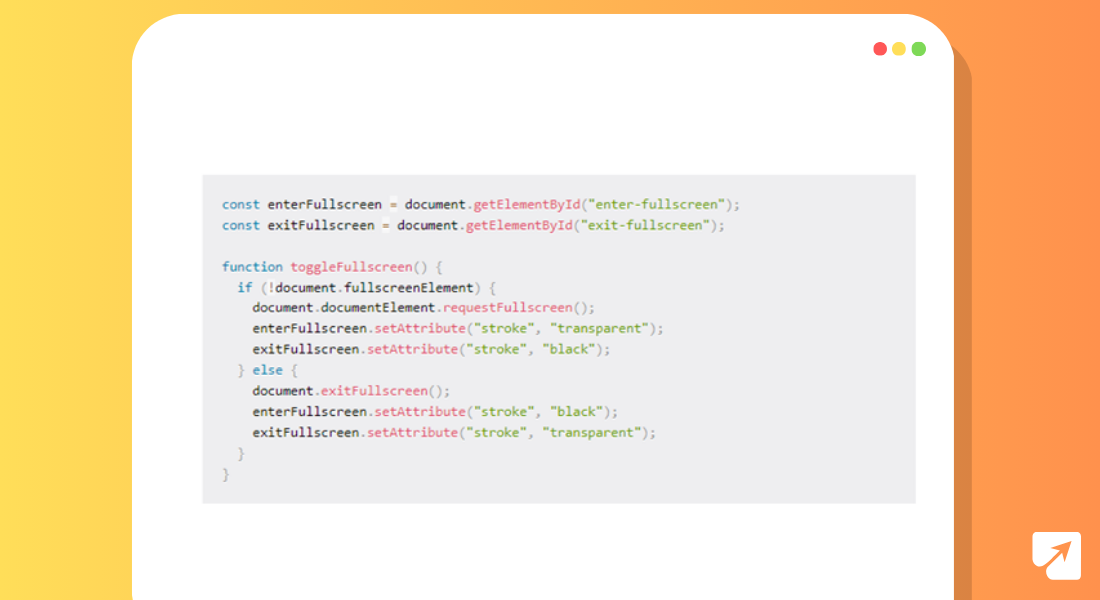
This approach permits the button’s appearance to change progressively founded on the current fullscreen mode, giving visual feedback to the client and boosting the convenience of the fullscreen toggle button.
With this information, you can make your website look astounding and work flawlessly on any device. Simply make sure to ponder making your site available to everybody, regardless of what device they’re utilizing. Furthermore, remember to ensure all that functions admirably in various internet browsers. So go on, mess with the Fullscreen API interface, and make your site a perfect spot for clients to investigate and appreciate. With a touch of training and creativity, you can make web encounters that really wow your audience.

Written by Vishal Shah
Vishal Shah is a seasoned tech leader and AI enthusiast with 10+ years of experience in software development. Specializing in AI/ML and intelligent apps, he’s delivered impactful solutions across data visualization, enterprise search, and more. With expertise in Python, Django, Java, and CloudOps, Vishal is passionate about driving innovation and shaping the future of technology.
July 17, 2025

July 14, 2025